

Walking into a beautifully designed room instantly lifts your mood, while a space that feels cheap or poorly put together can have the opposite effect. Even high-quality furniture can lose its appeal when certain design mistakes undermine the overall aesthetic. Interior designers consistently point to specific pitfalls that homeowners unknowingly fall into, transforming potentially elegant spaces into rooms that lack sophistication. Understanding these common errors can help you elevate your interior without necessarily spending more money. The key lies in making informed choices about proportion, arrangement, and style rather than simply purchasing expensive items.
Improper furniture size
The scale problem in modern interiors
One of the most significant mistakes that instantly cheapens a room’s appearance is furniture that doesn’t match the scale of the space. Oversized sofas crammed into small living rooms create a cluttered, uncomfortable atmosphere, while tiny furniture pieces floating in large rooms make spaces feel incomplete and awkward. Designers emphasize that proper proportions create visual balance and demonstrate thoughtful planning.
Consider these guidelines when selecting furniture for your space:
- Measure your room dimensions before shopping and bring those measurements with you
- Leave adequate walking space around furniture pieces, typically 30 to 36 inches
- Ensure coffee tables are proportional to sofas, generally two-thirds the sofa length
- Select dining tables that allow chairs to pull out comfortably without hitting walls
- Account for door swings and traffic patterns when positioning larger items
Visual weight matters
Beyond physical dimensions, visual weight plays a crucial role in how furniture appears in a space. Bulky, heavy-looking pieces can overwhelm a room even if they technically fit. Conversely, furniture with exposed legs, glass elements, or lighter materials creates an airier feel that makes rooms appear more spacious and intentional. This attention to visual balance separates professionally designed spaces from amateur attempts.
Understanding these principles helps you avoid the telltale signs of poorly planned interiors and sets the foundation for addressing other common design missteps.
Accumulation of visual clutter
When more becomes less
While a completely bare room feels cold and unfinished, the opposite extreme proves equally problematic. Visual clutter from excessive decorative objects, mismatched accessories, and unnecessary items creates chaos that makes even quality furniture appear cheap. Designers stress that thoughtful curation demonstrates sophistication, whereas random accumulation suggests a lack of design vision.
| Cluttered space characteristics | Curated space characteristics |
|---|---|
| Multiple small decorative items crowding surfaces | Fewer, larger statement pieces with breathing room |
| Mismatched frames and artwork scattered randomly | Coordinated gallery walls or strategic single pieces |
| Visible cords, remotes, and everyday items | Hidden storage solutions and cable management |
| Excessive throw pillows in competing patterns | Selective pillows in complementary designs |
Strategic editing techniques
Professional designers recommend the subtract-and-assess approach. Remove half of your decorative items, then gradually reintroduce only those pieces that serve a clear purpose or bring genuine joy. This editing process reveals which elements truly enhance your space and which merely contribute to visual noise. Storage solutions become essential tools in maintaining this refined appearance without sacrificing functionality.
Once you’ve cleared the visual clutter, the underlying design choices become more apparent, revealing whether your space has the cohesive direction it needs.
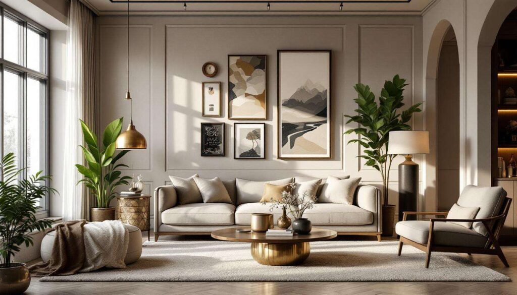
Lack of design harmony
The coherence factor
Rooms that feel expensive and well-designed share a common thread: intentional cohesion among all elements. When furniture styles clash without purpose, color palettes compete rather than complement, and materials seem randomly selected, the result reads as chaotic rather than eclectic. Designers distinguish between purposeful mixing, which creates interest, and accidental mismatching, which appears cheap.
Creating harmony doesn’t mean everything must match perfectly, but elements should relate to each other through:
- A consistent color palette with intentional accent colors
- Repeated materials or finishes that tie different pieces together
- A unifying style direction, even when mixing eras or aesthetics
- Consistent metal finishes throughout hardware and fixtures
- Coordinated wood tones that complement rather than clash
Building a cohesive vision
Establishing design harmony requires planning before purchasing. Create a mood board or collection of inspiration images that capture your desired aesthetic. Identify the common threads in these images—whether specific colors, materials, or stylistic elements—and use these as your guide when selecting furniture and décor. This intentional approach ensures that even budget-friendly pieces contribute to an elevated overall appearance.
While harmony throughout a space creates flow, certain design trends can actually work against this cohesion when overused.
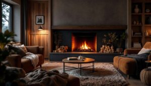
Overusing accent walls
When feature walls backfire
Accent walls gained popularity as an accessible way to add visual interest, but excessive or poorly executed accent walls often achieve the opposite effect. Designers note that randomly selecting a wall to paint a bold color without considering the room’s architecture, lighting, or furniture placement can fragment a space rather than enhance it. This approach often signals amateur design choices that undermine the perceived quality of your furnishings.
Strategic accent wall guidelines
When accent walls work, they follow specific principles. The featured wall should have architectural significance—perhaps it contains a fireplace, serves as the headboard wall in a bedroom, or has interesting architectural details worth highlighting. The color or material chosen should complement existing furniture rather than compete with it. Subtlety often proves more sophisticated than dramatic contrast, with textured wallpapers or muted tones frequently appearing more expensive than bright paint colors.
Consider these alternatives to traditional painted accent walls:
- Natural wood paneling or shiplap for texture without overwhelming color
- Subtle wallpaper with sophisticated patterns in neutral tones
- Built-in shelving that creates visual interest through function
- Large-scale artwork that serves as a focal point without permanent commitment
Just as walls set the backdrop for your furniture, the way you illuminate these elements dramatically affects their perceived quality.
Ill-conceived lighting
The illumination problem
Perhaps nothing cheapens a space faster than poor lighting choices. Builder-grade fixtures, single overhead lights, or mismatched lamps create harsh shadows and unflattering illumination that makes even expensive furniture look mediocre. Designers emphasize that lighting serves as jewelry for a room—the finishing touch that can elevate or diminish everything else.
Layered lighting approach
Professional spaces incorporate multiple lighting types working together. Ambient lighting provides overall illumination, task lighting serves functional needs, and accent lighting highlights architectural features or artwork. This layered approach creates depth and dimension while allowing flexibility for different moods and activities.
| Lighting layer | Purpose | Examples |
|---|---|---|
| Ambient | General room illumination | Ceiling fixtures, recessed lights, chandeliers |
| Task | Functional lighting for activities | Reading lamps, under-cabinet lights, desk lamps |
| Accent | Highlighting features and creating mood | Picture lights, wall sconces, uplighting |
Investing in dimmer switches and selecting fixtures with appropriate scale for your room transforms the atmosphere while showcasing your furniture in its best light, literally and figuratively. This attention to illumination naturally leads to considering how individual furniture pieces relate to one another.
Matching furniture sets
The matching set trap
Ironically, one of the most common mistakes people make when trying to create an upscale look is purchasing perfectly matched furniture sets. While these collections promise coordination, they often result in spaces that feel generic, uninspired, and reminiscent of showroom floors rather than personalized homes. Designers consistently advise against this approach, noting that curated collections of complementary pieces demonstrate far more sophistication.
The art of thoughtful mixing
Creating an elevated look requires mixing furniture pieces that share common elements without being identical. This might mean pairing a vintage dresser with a modern bed frame, united by similar wood tones, or combining different chair styles around a dining table, connected through a shared color palette. The intentional variety suggests pieces were collected over time with care rather than purchased in a single transaction.
Guidelines for successfully mixing furniture include:
- Vary the heights and shapes of furniture pieces to create visual interest
- Mix different materials while maintaining a cohesive color story
- Combine furniture from different eras while respecting scale and proportion
- Use area rugs and accessories to tie disparate pieces together
- Ensure at least one unifying element connects all pieces in a space
This approach requires more effort than selecting a matching set but results in spaces that feel authentic, personal, and decidedly more expensive than their actual cost.
Transforming your space from cheap-looking to sophisticated doesn’t necessarily require a complete overhaul or substantial investment. By addressing these six critical areas—furniture scale, visual clutter, design harmony, accent wall usage, lighting design, and avoiding matching sets—you can dramatically elevate your interior’s appearance. The common thread connecting these principles is intentionality: making deliberate choices based on design fundamentals rather than convenience or trends. Quality furniture deserves to be showcased properly, and these strategies ensure your pieces look as valuable as they truly are. Small adjustments in how you select, arrange, and illuminate your furnishings create cumulative effects that distinguish thoughtfully designed spaces from those that inadvertently signal cheapness despite your investment.