


Neutral rooms have become a cornerstone of modern interior design, offering versatility and sophistication that few other color schemes can match. However, creating a truly captivating neutral space requires more than simply painting walls beige or filling rooms with cream-colored furniture. Professional designers rely on specific principles to transform these seemingly simple palettes into dynamic, layered environments that feel both calming and visually engaging.
Understanding the Importance of Neutral Colors
The Foundation of Timeless Design
Neutral colors serve as the backbone of interior design for compelling reasons that extend beyond mere aesthetics. These shades create a canvas that allows architectural features, textures, and carefully selected accent pieces to shine without competing for attention. Unlike bold colors that can quickly feel dated, neutrals provide longevity and adaptability that make them invaluable for homeowners seeking enduring style.
The psychological impact of neutral tones cannot be understated. These colors promote relaxation and mental clarity, making them particularly suitable for spaces dedicated to rest and rejuvenation. Studies have shown that environments dominated by neutral palettes can reduce stress levels and improve focus, which explains their popularity in both residential and commercial settings.
Versatility Across Design Styles
One remarkable advantage of neutral colors lies in their compatibility with multiple design aesthetics. Whether your preference leans toward minimalist Scandinavian interiors, rustic farmhouse charm, or contemporary urban sophistication, neutrals adapt seamlessly. This flexibility allows homeowners to evolve their decor over time without requiring complete overhauls.
| Design Style | Preferred Neutrals | Typical Applications |
|---|---|---|
| Scandinavian | Whites, light grays | Walls, textiles, furniture |
| Farmhouse | Creams, taupes, warm beiges | Cabinetry, upholstery, accents |
| Contemporary | Charcoals, cool grays, blacks | Feature walls, flooring, fixtures |
Understanding these fundamentals sets the stage for exploring how to select the most appropriate neutral shades for your specific space.
Choosing the Right Shades of Neutrals
Assessing Natural Light Conditions
The amount and quality of natural light dramatically influence how neutral colors appear throughout the day. Rooms facing north typically receive cooler, indirect light that can make warm neutrals appear flat or even dingy. Conversely, south-facing spaces bathed in warm sunlight can handle cooler grays and whites without feeling sterile. Before committing to a shade, observe how paint samples look at different times of day under your room’s specific lighting conditions.
Matching Neutrals to Room Function
Different spaces benefit from distinct neutral approaches based on their intended use. Bedrooms and relaxation areas often work best with softer, warmer neutrals like taupe or greige that promote tranquility. Active spaces such as kitchens and home offices may benefit from crisper whites or cool grays that energize and enhance concentration.
- Living rooms: versatile mid-tone neutrals that transition well from day to evening
- Bathrooms: clean whites and light grays that emphasize freshness and cleanliness
- Dining rooms: warmer neutrals that create intimate, inviting atmospheres
- Entryways: sophisticated grays or taupes that make strong first impressions
Once you’ve selected appropriate base neutrals, the next consideration involves how these shades interact with other elements in your design scheme.
Pairing Neutrals with Other Tones
Creating Depth Through Contrast
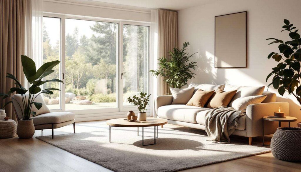
The most successful neutral rooms incorporate varying degrees of light and dark to prevent monotony. This principle, known as tonal variation, involves layering different values of similar hues throughout a space. For instance, pairing pale ivory walls with medium-toned taupe upholstery and darker charcoal accents creates visual interest while maintaining a cohesive neutral palette.
Contrast ratios matter significantly in neutral schemes. Designers recommend including at least three distinct tonal values in any room: a light base color, a medium anchor tone, and deeper accent shades. This three-tier approach ensures sufficient visual complexity without overwhelming the senses.
Introducing Strategic Color Accents
While maintaining a neutral foundation, carefully selected color accents prevent spaces from feeling sterile or uninviting. Accent colors should appear in approximately 10-20% of the room’s visual field, typically through accessories, artwork, or textiles. Popular accent choices that complement neutral backgrounds include:
- Warm metallics like brass and copper for sophistication
- Muted blues and greens for calming natural connections
- Terracotta and rust tones for earthy warmth
- Deep navy or charcoal for dramatic punctuation
Beyond surface colors, the subtle characteristics beneath each neutral shade play a crucial role in overall harmony.
Using Undertones to Enrich the Palette
Identifying Hidden Color Biases
Every neutral contains underlying color influences that become apparent when placed against pure white or in different lighting conditions. Beiges may lean pink, yellow, or gray. Grays can have blue, green, or purple undertones. Recognizing these subtle biases prevents clashing combinations and ensures cohesive room schemes.
To identify undertones, place paint samples next to bright white paper in natural daylight. The contrast will reveal whether your chosen neutral skews warm or cool. Additionally, consider how existing fixed elements like flooring, countertops, or cabinetry will interact with your selected neutrals. Matching undertone families creates harmonious relationships between all room components.
Coordinating Undertones Throughout Spaces
Consistency in undertone selection becomes particularly important in open-concept layouts where multiple areas flow visually into one another. Mixing warm-toned neutrals in one zone with cool-toned selections in an adjacent space creates jarring disconnection. Instead, maintain undertone consistency while varying the intensity or value of neutrals across connected areas.
| Undertone Category | Best Pairings | Avoid Mixing With |
|---|---|---|
| Warm (yellow, pink, orange) | Honey woods, brass, terracotta | Blue-grays, cool whites, silver |
| Cool (blue, green, purple) | Gray woods, chrome, slate | Beiges, creams, gold tones |
Mastering undertones helps avoid the pitfalls that commonly plague neutral room designs.
Avoiding Common Mistakes with Neutral Colors
The Single-Shade Trap
Perhaps the most frequent error involves using only one neutral shade throughout an entire room. This monochromatic approach eliminates the depth and dimension that make neutral spaces interesting. Without tonal variation, rooms appear flat and lifeless, regardless of how expensive or high-quality the furnishings may be.
Neglecting Texture and Pattern
In neutral rooms, texture becomes exponentially more important than in colorful spaces. Without varied surface qualities, even well-planned neutral schemes fall flat. Incorporate diverse textural elements through materials like linen, wool, leather, wood, metal, and stone. Each material catches and reflects light differently, adding visual richness that compensates for limited color variation.
- Layered textiles: combine smooth, nubby, and plush fabrics
- Mixed materials: pair matte finishes with glossy surfaces
- Natural elements: introduce organic textures through plants and raw materials
- Architectural details: emphasize moldings, paneling, or exposed beams
Insufficient Lighting Consideration
Lighting dramatically affects how neutral colors appear, yet many homeowners select shades without accounting for artificial light sources. Warm incandescent bulbs enhance yellow and pink undertones, while cool LED lighting amplifies blue and gray notes. Test your chosen neutrals under your actual lighting conditions, including both natural daylight and evening artificial illumination, to ensure they perform as expected throughout the day.
These considerations culminate in creating spaces that stand the test of time while remaining inviting and comfortable.
For a Timeless and Soothing Design
Balancing Trends with Classic Elements
While neutral palettes inherently possess timeless qualities, implementation details determine whether a room feels current or dated. Focus on classic proportions and quality materials rather than trendy accessories that quickly lose appeal. Invest in substantial furniture pieces in enduring neutral tones, then refresh the space periodically through easily changeable elements like pillows, artwork, and decorative objects.
Creating Personal Connection
The most successful neutral rooms reflect the inhabitants’ personalities despite their restrained color schemes. Incorporate meaningful objects, family heirlooms, or collections that tell your story. These personal touches prevent neutral spaces from feeling like sterile showrooms while maintaining the sophisticated restraint that makes neutrals appealing.
Neutral color schemes offer unparalleled flexibility and sophistication when executed with attention to tonal variation, undertones, texture, and lighting. By following these four essential rules, designers create spaces that feel both calming and visually engaging, proving that neutral rooms need never be boring. The key lies in understanding that successful neutral design requires just as much thought and planning as any bold color scheme, with careful consideration of how each element interacts within the overall composition. When properly implemented, neutral palettes provide enduring beauty that adapts gracefully to changing tastes and lifestyles.