

Choosing the right paint colors can transform any space from ordinary to extraordinary, and the latest trends reveal shades that make decorating simpler than ever. The palette for this year emphasizes versatility, warmth, and timeless appeal, offering homeowners an array of options that work beautifully across different rooms and lighting conditions. From soft neutrals to rich earth tones, these colors provide the perfect foundation for creating inviting, stylish interiors without the stress of complicated design decisions.
Color Trends 2026
The dominant theme in paint color trends centers on warm and inviting hues that create comfortable living spaces. Designers are moving away from stark, cool grays toward warmer neutrals and medium-light shades that offer freshness without overwhelming darkness. This shift reflects a broader desire for homes that feel welcoming and nurturing.
Warm Versus Cool: The Shift in Preference
The balance between warm and cool tones has shifted decisively. Warm shades now dominate interior design choices, offering a sense of coziness and comfort. These colors include:
- Creamy whites with yellow or beige undertones
- Soft taupes and warm grays
- Light terracotta and peachy neutrals
- Muted greens with earthy bases
These hues create spaces that feel naturally lit and spacious while maintaining an inviting atmosphere. The preference for medium-light colors ensures rooms don’t feel too dark or heavy, striking the perfect balance for effortless decorating.
The Psychology Behind Color Choices
Color psychology plays a significant role in these trends. Warm earth tones evoke feelings of stability and connection to nature, while soft pastels promote calmness and serenity. Understanding how colors affect mood helps homeowners make informed decisions that enhance their daily living experience.
| Color Family | Psychological Effect | Best Application |
|---|---|---|
| Warm Neutrals | Comfort, stability | Living rooms, bedrooms |
| Soft Pastels | Calm, serenity | Nurseries, bathrooms |
| Earth Tones | Grounding, natural | Dining rooms, studies |
| Ice Blue | Refreshing, peaceful | Bedrooms, home offices |
These psychological considerations make certain colors naturally easier to work with, as they create harmonious environments that require minimal additional styling. Understanding these foundational trends helps guide decisions about which specific shades will work best in different living spaces.
Essential Colors for the Living Room
The living room serves as the heart of the home, making color selection particularly important. Versatile neutrals combined with strategic accent colors create spaces that feel both sophisticated and comfortable.
Foundational Neutrals for Living Spaces
Several shades stand out as exceptionally practical for living rooms. Crushed Ice, a popular light neutral, offers remarkable adaptability across various lighting conditions. This shade provides a clean backdrop that works beautifully with both modern and traditional furnishings. Similarly, Pale Oak brings warmth through its creamy undertones, particularly effective in spaces with abundant natural light.
For those seeking a slightly bolder approach, soft greens like Willow Tree introduce natural elements without overwhelming the space. This shade pairs exceptionally well with wooden furniture and natural textiles, creating a cohesive, organic aesthetic.
Creating Depth with Layered Tones
The most successful living room color schemes incorporate multiple shades within the same color family. This approach creates visual interest while maintaining cohesion:
- Start with a base neutral on main walls
- Use a slightly deeper shade for accent walls or architectural features
- Incorporate the lightest version on trim and ceilings
- Add complementary colors through furnishings and accessories
This layering technique ensures the space feels intentionally designed rather than flat or one-dimensional. The beauty of working with these trending colors lies in their forgiving nature, making it difficult to create jarring combinations. With these living room foundations established, attention can turn to the broader neutral palette that makes decorating truly effortless.
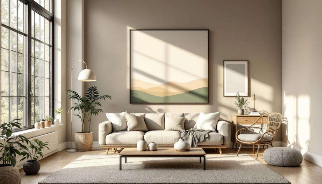
Neutral Tone Palette for Easy Decorating
Neutrals remain the cornerstone of stress-free decorating, offering flexibility that allows homeowners to refresh their spaces without complete overhauls. The current neutral palette extends beyond basic beiges and grays to include more nuanced, sophisticated options.
Expanded Neutral Options
Today’s neutrals encompass a rich variety of undertones and depths. Creamy whites with subtle warmth prevent spaces from feeling clinical, while soft beiges ground rooms without making them feel dated. Light grays with warm undertones offer modernity without coldness, and greige blends the best of both worlds.
| Neutral Type | Undertone | Ideal Pairing |
|---|---|---|
| Creamy White | Yellow/Beige | Natural wood, brass fixtures |
| Soft Beige | Pink/Peach | White trim, colorful textiles |
| Warm Gray | Brown/Taupe | Black accents, greenery |
| Greige | Balanced | Versatile with most colors |
The Versatility Advantage
What makes these neutrals particularly valuable is their compatibility with changing decor trends. A neutral base allows homeowners to update their space through accessories, artwork, and furnishings without repainting. This long-term flexibility represents both practical and financial advantages, making neutrals the smartest choice for those seeking effortless style that endures. While neutrals provide the perfect canvas, strategic use of deeper colors adds personality and visual impact.
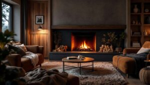
Accentuate with Deep and Dramatic Colors
While neutrals form the foundation, deep, dramatic colors bring personality and sophistication to interiors. Used strategically, these bolder shades create focal points without overwhelming spaces.
Strategic Application of Bold Colors
The key to successfully incorporating dramatic colors lies in thoughtful placement. Accent walls remain popular, allowing homeowners to introduce richness without committing entire rooms. Consider these approaches:
- Paint one wall in a dining room with deep terracotta or forest green
- Use rich navy or charcoal in a home office for focus and concentration
- Apply warm rust or burnt orange in powder rooms for memorable impact
- Introduce deep plum or burgundy in bedrooms for luxurious ambiance
Balancing Drama with Restraint
The most successful use of deep colors involves balance. Pair dramatic walls with lighter furnishings, or use bold paint in smaller doses through architectural details like built-in shelving or door frames. This approach allows the dramatic elements to shine without creating visual fatigue.
When selecting deep colors, consider how natural and artificial lighting affects their appearance throughout the day. Test samples extensively to ensure the chosen shade maintains its appeal under various conditions. These bold choices work best when complemented by the carefully selected signature colors that define this year’s palette.
2026 Colors of the Year Not to Miss
Several standout shades have emerged as defining colors, each offering unique characteristics that make decorating easier and more rewarding.
Ice Blue: The Versatile Refresher
Ice Blue stands out for its remarkable adaptability. This cool yet inviting shade works beautifully in bedrooms, bathrooms, and home offices. Its calming properties promote relaxation while maintaining enough visual interest to prevent blandness. Ice Blue pairs exceptionally well with white trim, natural wood tones, and metallic accents.
Earth Tones: Grounding and Natural
Rich browns, muted terracotta, and soft greens represent the earth tone family that continues gaining popularity. These colors create:
- Immediate warmth and comfort
- Strong connections to natural environments
- Timeless appeal that transcends trends
- Easy coordination with organic materials and textures
Soft Pastels: Delicate Sophistication
Gentle pastels offer understated elegance perfect for creating serene spaces. Unlike their bolder predecessors, current pastels feature subtle complexity through nuanced undertones. Pale pink with gray undertones, soft lavender with beige bases, and muted mint with cream influences provide sophistication without sweetness.
| Signature Color | Best Room Application | Complementary Accent |
|---|---|---|
| Ice Blue | Bedrooms, bathrooms | White, natural wood |
| Terracotta | Dining rooms, kitchens | Cream, olive green |
| Soft Green | Living rooms, studies | Warm neutrals, brass |
| Pale Pink | Bedrooms, nurseries | Gray, gold accents |
These signature colors provide ready-made solutions for homeowners seeking current, sophisticated palettes without extensive design knowledge. Their proven appeal and versatility make them safe yet stylish choices. Implementing these colors successfully requires understanding how to create balanced, harmonious interiors.
Inspiration and Tips for a Balanced Interior
Creating a cohesive, balanced interior involves more than selecting beautiful colors. Thoughtful implementation ensures spaces feel intentional and harmonious.
Testing Before Committing
The most critical step in paint selection involves extensive testing. Purchase sample sizes and apply them to large poster boards or directly on walls. Observe these samples:
- At different times throughout the day
- Under natural morning and afternoon light
- With artificial lighting in evening conditions
- Next to existing furnishings and flooring
Colors can appear dramatically different depending on lighting conditions, making this testing phase essential for avoiding costly mistakes.
Coordinating with Existing Elements
Successful color selection considers existing room elements that won’t change. Flooring, cabinetry, and permanent fixtures should inform paint choices rather than conflict with them. If flooring has warm undertones, choose paint colors that complement rather than fight this warmth.
Planning for Future Flexibility
Choose colors with long-term versatility in mind. While trendy shades may feel exciting initially, more timeless options allow easier updates through accessories and furnishings. This approach provides the best balance between current style and enduring appeal, ensuring homes remain fresh without constant repainting.
The easiest decorating happens when colors work together naturally, creating spaces that feel both current and comfortable. By selecting from these trending palettes and implementing them thoughtfully, any homeowner can achieve professional-looking results that stand the test of time.
The paint colors trending this year offer unprecedented ease for creating stylish, inviting homes. From versatile neutrals that provide endless flexibility to strategic bold accents that add personality, these shades work together harmoniously. Whether embracing warm earth tones, refreshing ice blues, or timeless creamy whites, homeowners have access to a palette that simplifies decorating while delivering sophisticated results. Testing colors thoroughly, considering existing elements, and planning for future adaptability ensures these choices remain satisfying for years to come, proving that effortless decorating is entirely achievable with the right color foundation.